As a leading essential services provider, SA Water has heavily invested in customer experience over the past five years. Their web portal, MySAWater, has been a great success, with over 180,000 customers registered online. The portal allows customers to self-serve for information about their water supply, pay bills, arrange direct debits, and manage multiple properties. This digital-first approach has become the preferred channel for customers who prefer online interactions over phone calls.
For SA Water, the web portal provides customers with immediate self-service, while also significantly reducing paper bills. The portal has provided cost-savings, reduced the impact on the environment, and improved service.
The challenge
Building on this success, SA Water identified some areas for improvement to further enhance the portal’s operation. Some customers encountered challenges during registration, particularly with entering the exact details from their water bill, which increased calls to the utility’s Customer Care Centre.
Additionally, setting up bill payment plans could be improved, as eligibility checks at the end of the process led to some customers abandoning their requests. Simplifying the user experience by reducing lengthy instructions and upfront text would further enhance the portal’s usability.
The approach
SA Water partnered with Escient to address these opportunities through a user-centred approach, incorporating the latest thinking in content design.
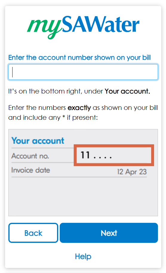
The registration process for the web portal was redesigned, breaking it into smaller steps so the customer does one task at a time. Highlighted pictures of the water bill were displayed at every step, showing exactly what was required. Improvements in web accessibility (following WCAG standards) made the portal more inclusive. User testing before and after the redesign ensured that customer feedback was included in the design.
For bill payment plans, the revised eligibility checks were moved to the start of the process, improving clarity and saving time. The user experience was streamlined by simplifying the language and explaining just what they needed to know at each step. For those customers who weren’t eligible for a payment plan, we provided prominent options to steer them towards SA Water’s Payment Assistance program, with four ways to make contact (live webchat, web enquiry, email or phone).
Before going live, the final design was re-tested with customers and received very positive scores about the changes.

We’ve always been customer-focused, but working with Escient helped bring a new perspective to the UX design. We’ve made real improvements in how we reach our online customers.
— Tom Lewis, Product Owner – Digital Transformation Team
SA Water
The outcome
The redesigned MySAWater portal has been live for nine months, delivering outstanding results.
Customer registrations have increased by 21% each month, indicating a smoother and more successful sign-up process.
Payment Plans have seen a 71% monthly increase, helping customers better manage their water bills and reducing overdue accounts.
Requests for help from customers requiring tailored payment assistance have surged by 327% monthly, compared to the same period last year – ensuring SA Water maintains support for these more complex arrangements.
Overall, the UX improvements to the MySAWater web portal show the power of thoughtful design and SA Water’s commitment to exceptional customer experience. These significant measurable improvements demonstrate the value of user-centred design and highlight the benefits of this collaboration.